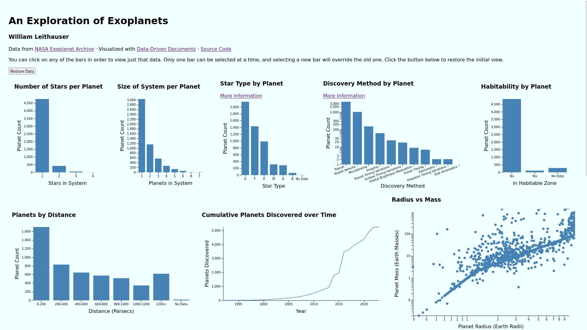
In this project, I created a visualization of a large dataset regarding exoplanets (that is, planets outside of our Solar System). This visualization allows the viewer to see various different properties of those planets and how they relate to each other. One can also select specific data points to see how they affect each other. This visualization allows the viewer to see trends in exoplanet data that might not be clear looking at the raw data in a spreadsheet, for instance.

The data for this project comes from the NASA Exoplanet Archive1, a catalog of exoplanet data hosted by NASA. I performed some preprocessing to better fit the data to the visualization I wanted to make, however all data comes from the same source. The dataset contains various characteristics of over 5,000 exoplanets, including their name, number of stars in the system, discovery method and year, semi-major axis, mass, radius, and distance, among others. In addition, I wrote a python script which calculated the star type based on its mass and added this data to the set.
One thing that I had to deal with was missing data. For the bar charts, I simply created an extra bar, sorted to the end, showing where the missing data was. For the scatter plot, the only thing that made sense was to completely exclude planets that didn’t have data for both radius and mass, as using a zero value could be misleading and distort the data.
The visualization consists of the following components:
Hovering over any location of these visualizations allows one to view the exact value at that point. Clicking on any of the bars from the bar charts or histogram will filter the rest of the data based on that selection, and it will update the rest of the visualizations and the table based on that filtration. There is a button that will restore the visualization to its initial state.
To me, the most useful part of this visualization is that it allows you to cordon off specific kinds of planets and see how that data differs from the whole. For instance, planets that are in the habitable zone tend to be much closer to their stars. Looking at the line chart vs discovery method, most discovery methods show a linear trend since the early 90s, except for the transit method; this shows a big jump in the mid-2010s, corresponding to an overall significant increase in exoplanetary discoveries during that period. This is just what I’ve been able to glean, as someone with no formal experience in astronomy; I’m sure there are plenty more fascinating things that can be seen in this visualization
This project was written in JavaScript using Data-Driven Documents. To run the code, clone the repository here, and run using any HTTP server. A live demo is available on this website as well.
In essence, the visualization consists of a bunch of SVG renderings of visualizations with the heavy lifting done by d3. The HTML and CSS are simple and handwritten, as I tend to prefer minimalist web design. The general procedure I followed was: 1) load in the data for the visualization 2) display the axes and chart elements 3) render the chart based on the data. There was also some preprocessing done to the data, for which I used Python, my favorite scripting language.
The structure of this code is, for lack of a better term, terrible. I tried to separate out different kinds of visualizations into different classes/files but there was still a lot of duplicated code. I feel strongly that I should have frankly started over from the beginning with a better overall organization, but there simply was no time.
To some extent, I would attribute this poor organization to my inexperience with JavaScript. Before this class, I hadn’t written a single line of JS code, so I’ve been learning as I go. I learned some from doing smaller projects, but that didn’t translate to something larger as well as I had hoped. However, I do think I’ve learned a lot about how to better structure such a project in the future.
One thing I spent a bunch of time working on but never was able to quite figure out was having a log scale toggle. Some of the visualizations were best viewed with a log scale, but I think using such a scale sometimes can distort peoples' perceptions of the data, so I wanted a toggle that would have switched between the two in real time. That way, the user would be able to see exactly how much the log scale distorts the data. If I had more time, I also would have liked to dive further into the data and explore more different kinds of visualizations.
In terms of challenges, the biggest thing I struggled with was my relative unfamiliarity with JavaScript and d3. It took me longer than I would have liked to finish certain parts of the visualization, but thankfully there wasn’t one single thing that I felt ruined this project. Overall, I am happy with the way things turned out.