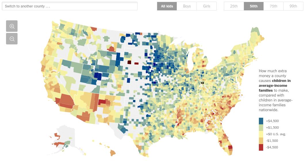
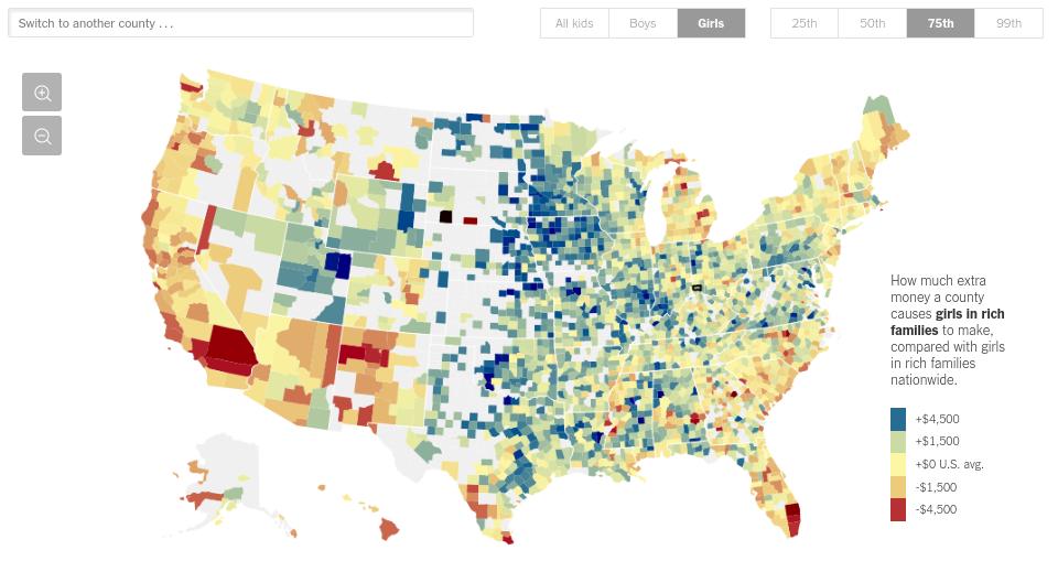
This visualization , by “The Upshot” for the New York Times, shows how the county in which a child is raised affects their future income. The fundamental basis of this visualization is a map, showing future outcomes across the country county-by-county with color being used to show better or worse outcomes. The user can filter the data by gender or familial income percentile.
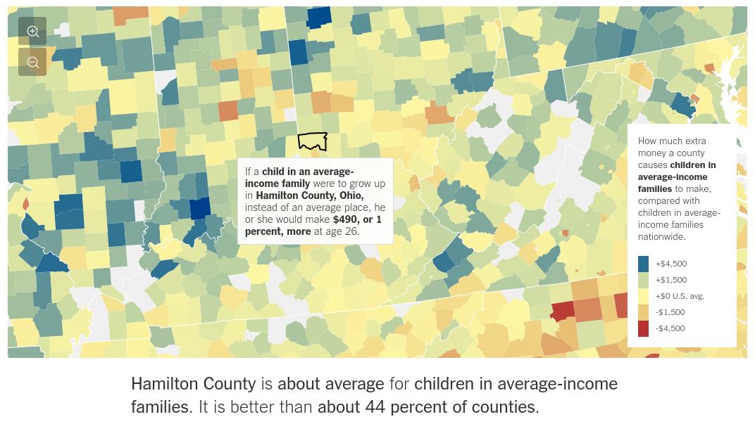
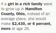
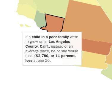
This visualization also allows one to select and view data on specific counties, with helpful tooltips showing specific data and how that county compares to the rest of the nation. You can select the county by clicking on the map or by using a search bar.
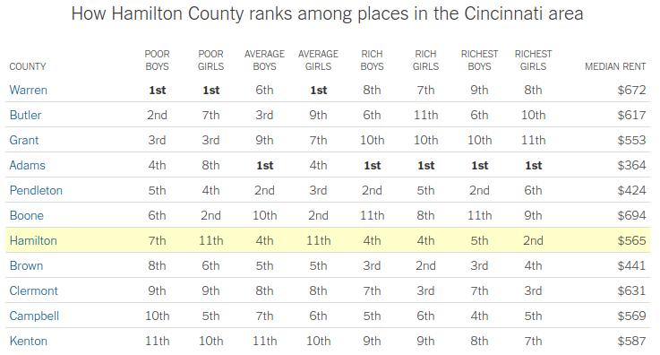
Underneath the visualization, it also shows detailed information about each demographic group in that county and how the county compares to others in the same metropolitan area. These look like mere tables, but they are interactive and update with the selection of the user in the main visualization.

This visualization uses the dataset from a report called “Social Capital and Economic Mobility”, by Opportunity Insights. The full dataset is huge, and includes lots of county-by-county data for income mobility.
The data were collected from, per the study authors, “Facebook users aged between 25 and 44 who reside in the United States, were active on the Facebook platform at least once in the prior 30 days, have at least 100 U.S.-based Facebook friends, and have a non-missing residential ZIP code as of May 28, 2022” (Chetty et al. 2022).1 For privacy reasons, data from zip codes with few datapoints were excluded.
Since this dataset comes from an internet-based survey, it isn’t exactly ideal, but for wide-ranging data from across the country I think this is likely about as good as it gets. There is enough data for most of the counties, and the methodology is good enough to make an interesting and useful visualization.
Naïvely it might be appropriate to say that the visualization is for everyone, which is mostly true; the New York Times is a news outlet writing for a general audience. To get more specific, the data could be useful to people looking for places to live, or for policymakers on the state or local level. Ultimately, this visualization shows economic mobility for several classes of people across the country, and this sort of data could have a wide range of potential uses and I think many people would find it interesting.
When thinking about the subject of this visualization, one might ask some of the following questions:
Which areas (state/county) allow for higher amounts of income mobility?
Which counties within the same metropolitan area have different outcomes?
How does a child’s family’s income affect the child’s mobility across the country?
What trends can we see across the country as a whole in terms of income mobility?
This visualization provides answers to all of those questions. You can see the state and county borders, and select individual counties to view the data on a specific or granular level. There is a view comparing the outcomes in different counties in the same metropolitan area. This vizualization also allows the user to filter based on several parameters, including family income. And finally, looking at the map as a whole, one can see trends across the country.
Looking at the data as a whole, the viewer might see areas of high mobility (such as the midwest and continental west), and low mobility (like the south and costal areas.) They might want to look at their own county in particular, which could be any but for the purposes of this demonstration I looked at Hamilton county. Hamilton county is about average for the country, though slightly worse than average. Notably Hamilton county does worse than other counties in its metropolitan area – this could be explained by demographic factors, or perhaps other reasons from the county itself.
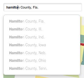
This visualization makes some very good design choices for the most part. There was a lot of attention done to user experience; as an example, I felt that the search was particularly user-friendly. In all, the map was extremely usable, with good UI elements, good coloring, and the use of emphasis to help the user to see the important things. In particular, the usage of bold is very effective.
The ability to filter based on gender and income percentile was nice, but more options would have been nice. I can appreciate where the designers were coming from though, it’s hard to strike the right balance between simplicity and flexibility.

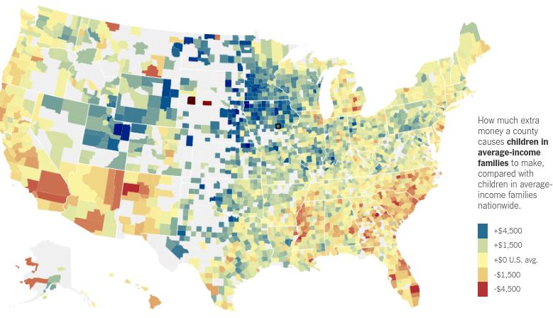
Here’s an example of how the visualization changes based on your selections:

One area I did find somewhat lacking was the comparison of counties in the same metropolitan area. It was just a table with no color, and the rankings were hard to parse given that there were so many and very little distinction. I felt my eyes glaze over a bit when I was looking at this section.

As mentioned in the previous section, I think the main limitation of this visualization is that there’s very little demographic information that can be used to filter the overall dataset. Currently the only options are gender and family income, which are good categories but quite limiting. I read the writeup from Chetty et al, and there was a lot more included in the study that the authors could have used. For instance, they gathered a lot of information on educational attainment – I think a view of this sort of data would have been fascinating.
Overall, this visualization does a good job at two things: country-wide trends and viewing individual counties. I can see why they made this choice, as when the user visits the page likely all they’ll do is look at a map of the whole country, then view the county they live in. On the other hand, as a data junkie myself, I wish they would have included more options to see what sort of effect they would have on the data. It’s possible they didn’t include these options because it didn’t change much and would have added additional complexity, but there was no discussion of that in the article itself. In total, I am a big fan of this visualization, and basically anything The Upshot does.
Changing the county in the table view and highlights

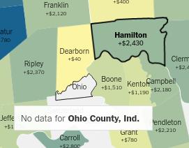
Handling of counties with no data
The most populous county in the country
Chetty, R., M. O. Jackson, T. Kuchler, J. Stroebel, N. Hendren, R. Fluegge, S. Gong, F. Gonzalez, A. Grondin, M. Jacob, D. Johnston, M. Koenen, E. Laguna-Muggenberg, F. Mudekereza, T. Rutter, N. Thor, W. Townsend, R. Zhang, M. Bailey, P. Barberá, M. Bhole, and N. Wernerfelt (2022). Social capital I: Measurement and associations with economic mobility. Nature 608 (7921), 108–121. https://s3.us-east-1.amazonaws.com/hdx-production-filestore/resources/fbe5b0b9-e81c-41c7-a9f2-3ebf8212cf64/data_release_readme_31_07_2022_nomatrix.pdf?AWSAccessKeyId=AKIAXYC32WNAQNXGU66R&Signature=xtT63gfMApw5dWCf0QrEMwPmqYk%3D&Expires=1680230764 ↩︎