The motivation for this application is to better visualize and understand the 311 (non-emergency) calls in 2021 in the City of Cincinnati. The city of Cincinnati already has a data portal with basic data analysis, but we wanted to go one step further, and showcase the data in detail with interactive visualizations.
The data was pulled from Cincinnati’s 311 (Non Emergency) Service Requests as a TSV file and holds information about all service requests from 2012 to now, specifically about how long the requests have been open, their locations, the request types, and other useful facts. The source of the data came from the “Fix It Cincy!” mobile app, which allows Cincinnati residents to directly submit service requests to city departments.
We chose to use the data from 2021 to speed up processing.
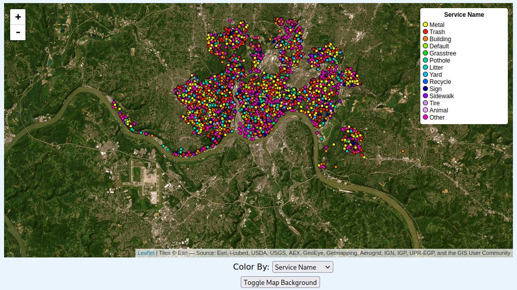
At the forefront of the application is a leaflet map with data points pertaining to the locations of the service requests.
Using the “Color By” selection bar, a user can color the datapoints to categorize the datapoints by a certain type.
Service Name: Being that the data was nominal, the color scheme used was categorical to classify the data as clearly as possible. Due to the high number of unique service names, the data had to be grouped to ultimately end up with 14 unique colors.
Agency: The data relevant to the type of agency handling the request was also nominal, which led to a similar color scheme being used – categorical, with 17 unique colors to separate the differences in the agencies.
Called Date: This data was ordinal, so the color scheme used was monochromatic – service requests that were created earlier in the year were colored white, with the color growing darker as the service requests came later in the year.
Response Time: This data was also ordinal, and as a result the color scheme used was monochromatic as well. For service requests that were completed within 1 day, their color was a soft yellow – for longer requests, the color grows into a more intense orange.
With the “Toggle Map Background” button, the user can also toggle the map background from displaying an ESRI satelite view to a Stamen roads/boundaries view.
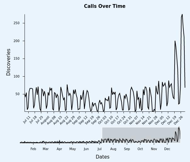
The timeline features an interactive version of the ‘Calls by Day’ Bar Chart where users can see the number of service calls for each day in 2021. It also allows users to see the trend of calls over 2021 (for example, the brushing context at the bottom of the timeline shows that there were more calls in the second half of 2021 than the first half of 2021). Some ways users can interact with the timeline:
Users can use the brushing context at the bottom of the timeline to zoom in and out of a period of days and months as they wish.
They can create a box over the time period they wish to see in the brushing context.
The timeline also uses tooltips for each data point to get an accurate date and number of service calls for that date.
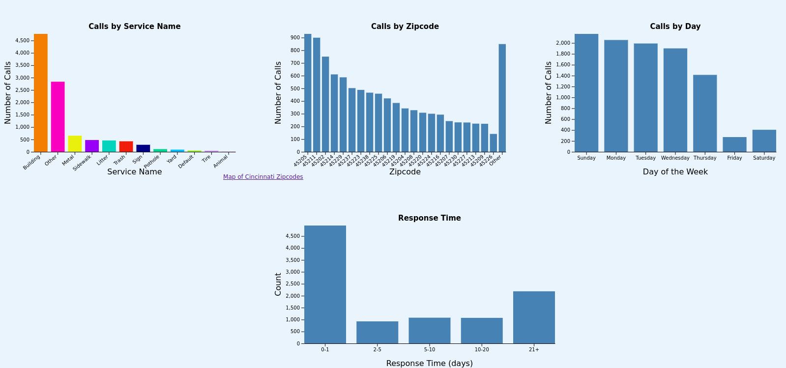
We created 4 additional bar chart visualizations for this project. These views are described as follows:
“Calls by Service Name” charts the frequency of calls by each type, and is color coordinated with the map (I.e. when you select “color by service name,” it will share coloring with this view).
“Calls by Zipcode” shows the 22 most common zip codes and an “other” category. There were too many zip codes in the Cincinnati area for us to chart, and we noticed that many of them had relatively few calls, so we combined the last few.
“Calls by Day” shows on which day most of the calls occur, Sunday-Saturday. This was one of the simpler views, but certainly presents an interesting perspective.
“Response Time” is a pseudo-histogram, showing how long it takes to respond to a call. The overwhelming majority of the calls were responded to within a day or two, so we didn’t have too many buckets here.
We used a common class for all our bar charts to reduce the complexity of our code base. This decision also allowed us to easily implement data filtering – clicking on any of the bars on the bar chart will filter the rest of the bar charts and the map (although not the timeline, due to the brushing we have). We also included a button beneath the map that allows the user to restore the data to its initial view. The bars have also been fully styled with CSS and animated.
We created two sketches before starting on this project. For our sketches, we focused on the two main views of this project: the map and the timeline.
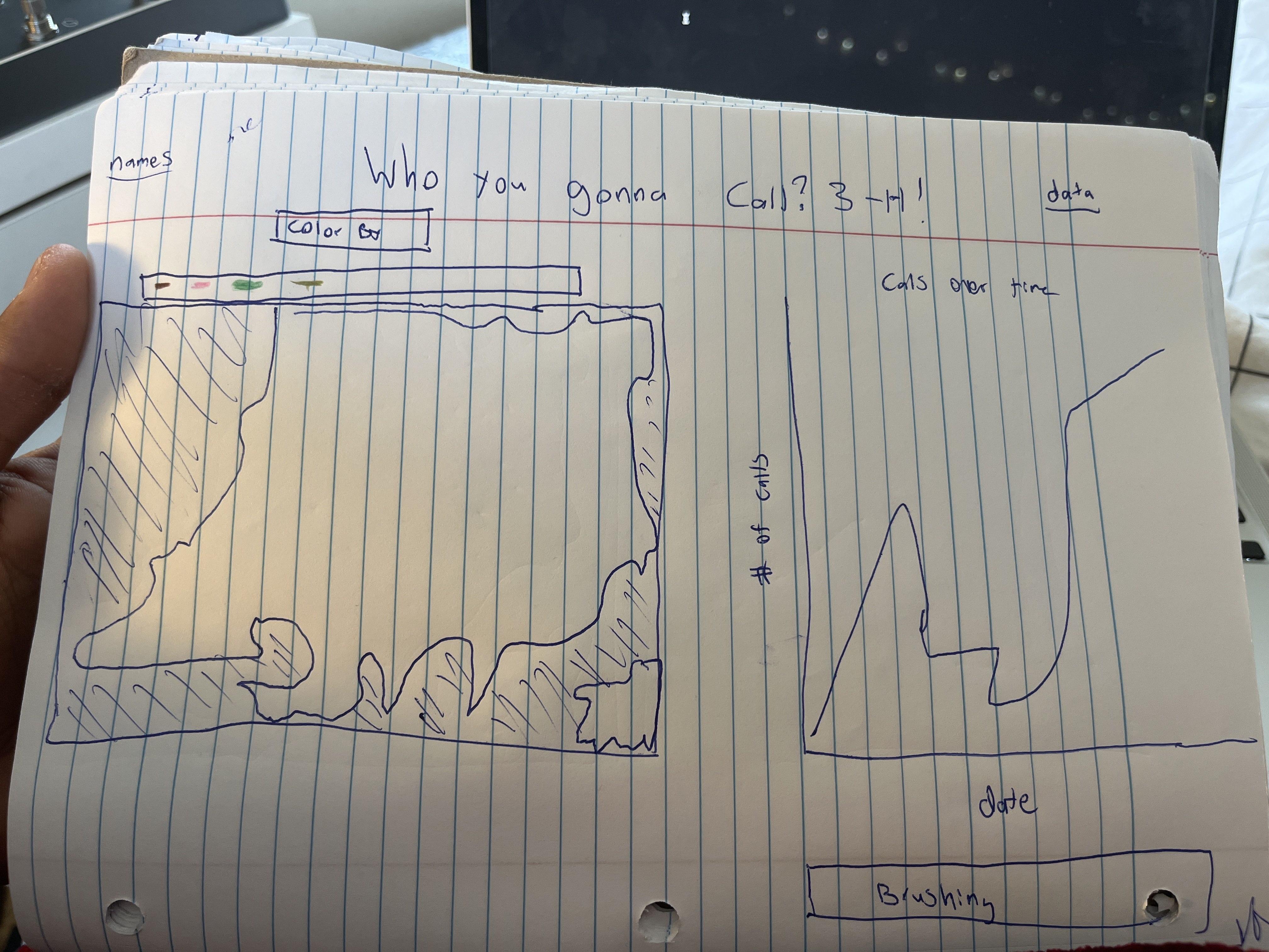
This sketch is relatively close to what our project ended up looking like. You can see the map on the left, with an early prototype of what it might look like to have a color switcher and legend. On the right, we have our timeline; we knew early on that we wanted to do brushing for this view, so in this sketch we placed the brushing directly underneath.
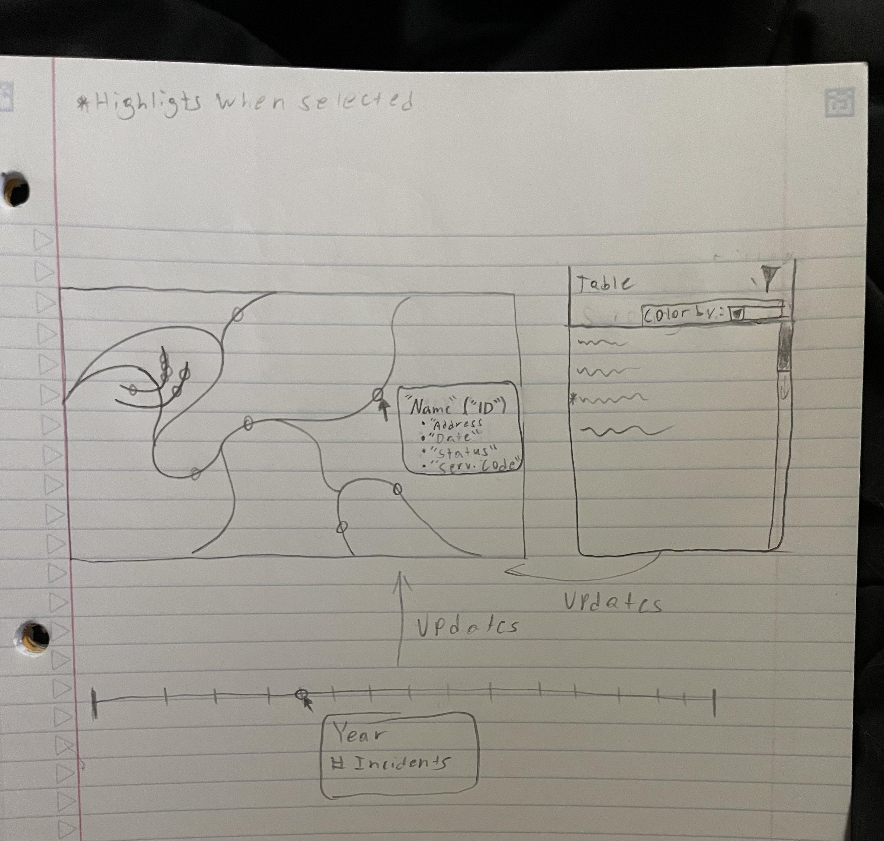
This second sketch shows off some of the other ideas we had. On the map view, it shows the tooltips that more or less made it to the final version. To the right of the table is an idea for a table that we decided to scrap in order to focus on other parts of this project. Underneath is an idea for a timeline that shows incidents by year, which we ended up implementing with a line graph instead.
This sketch also was our first exploration of how this visualization might be made interactive. The arrows show how the data might be linked to each other, and how selecting one could filter the others. We also showed which elements would need to be highlighted when selected by the user.
With this application, we discovered the following:
There were 4767 building service calls, which was significantly higher than the other service call categories
Zip Code 45205 had the greatest number of service calls among all zip codes with 929 calls.
The most popular day of the week for service calls was Sunday with 2167 calls, which is ironic when Friday (271 calls) and Saturday (405) had the lowest number of calls.
The City of Cincinnati had a speedy response time with 4943 calls out of 10204 being serviced within a day.
27 December 2021 had the most discoveries at 275.
The second half of 2021 had more calls than the first half of 2021.
The application was written in JavaScript with its D3 library – each type of visualization had its own class (LeafletMap, Timeline, Barchart) and was created in a main.js file. The code for the project can be found on GitHub and run using Python’s SimpleHTTPServer – the application is also hosted here.
Kunal Kewalramani
Timeline Tooltips
Timeline Brushing
Documentation
Demo Video
Nicholas Bowling
Map Elements
Map Tooltips
Point Plotting
Layout
Sidath Marapane
Data processing
Timeline
Color By options/color schemes
Bug fixes
William Leithauser
Map Legend
Bar Charts (implementation and documentation)
Data Filtering and Animations