
The motivation for this application is to visualize the involvement of characters in Futurama. We are using different visualizations to show the most important characters, how much do they speak in a season and even in a particular episode. We also show some of their popular words and phrases. This is all done interactively.
The data can be found on the infosphere - a website with the transcripts for the entire show created by Futurama enthusiasts. While there were many different fields/information that we could have parsed into our data, we chose to get the date of a given episode, season, episode number within the season, character, character’s line, any actions they may have taken, and the episode number within the whole show. While many of the fields were not used, future work on the application could involve using those fields.
Scraping the data was fairly straightforward, and a Jupyter Notebook was used for ease of use. The process simply involved grabbing each episode row from the tables off the infosphere, parsing fields from those rows, and using the links provided in those rows to access the actual transcript data, which was then scraped. Using Pandas, BeautifulSoup, and python’s request library, we were able to write a dataframe out to a CSV.
The data was not very clean at first due to formatting inconsistencies within the infosphere. We overcame these issues by writing a few helper functions to handle those inconsistencies as well as manually replacing some of the affected rows.
Our script can be found in our project repo – here.
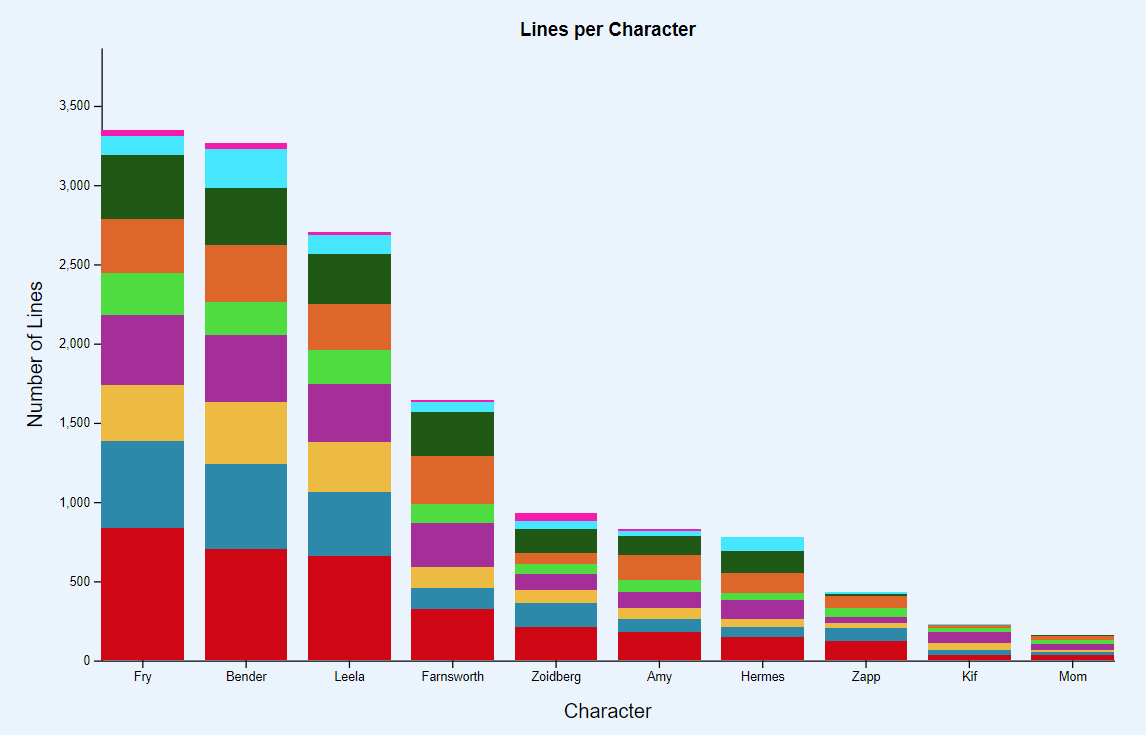
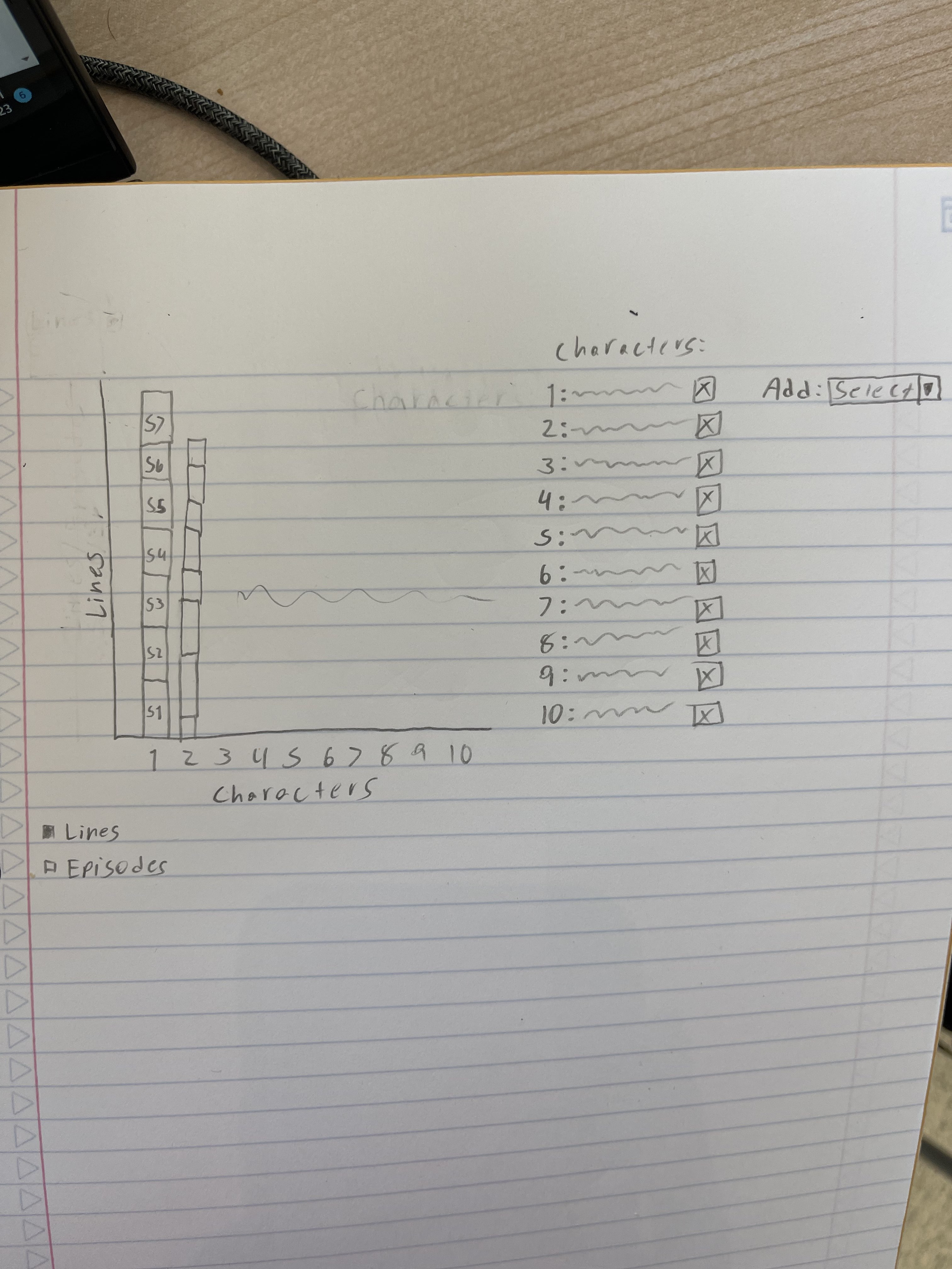
This bar chart is at the forefront of the application. It shows how many lines each of the 10 most important characters spoke across all seasons. It is also using layers of colors to show the different seasons these characters were involved in. We also have a character selector where you can filter the characters you wanna compare and see side by side. This is also useful to see characters like Mom whose bars are really small.
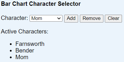
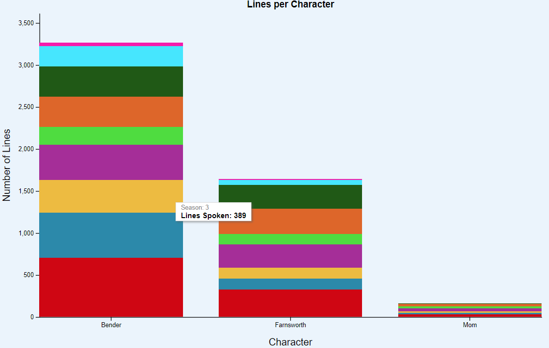
For example, you can select Farnsworth, Bender, and Mom, so the bar chart will filter like below. Another thing to note is the tooltips that show the season and how many lines they spoke in that season.

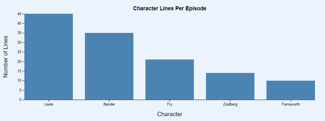
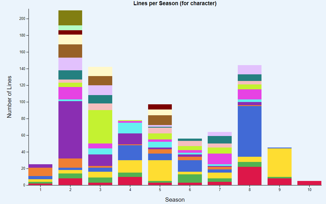
This bar chart has a filter where you can select the exact season and episode you want and it will show which characters are in that episode and how many lines each character spoke in that particular episode.
This section shows the images of the top 10 characters from the show which we have used in our visualizations. Below their images, their name and link to their fandom page are included along with a button to update corresponding visualizations to learn more about them.

This stacked bar chart features how many lines a particular character spoke across all seasons divided into episodes by color.
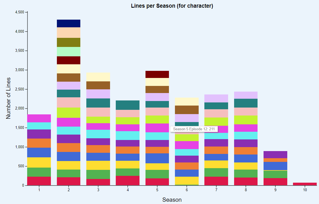
For example, if you click on ‘Update Visualizations’ under Zoidberg the bar chart changes to the one below.
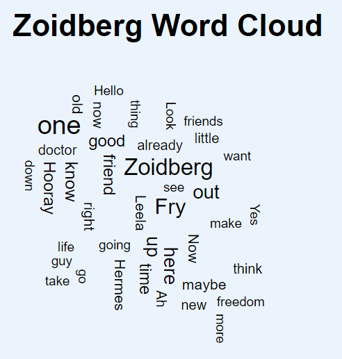
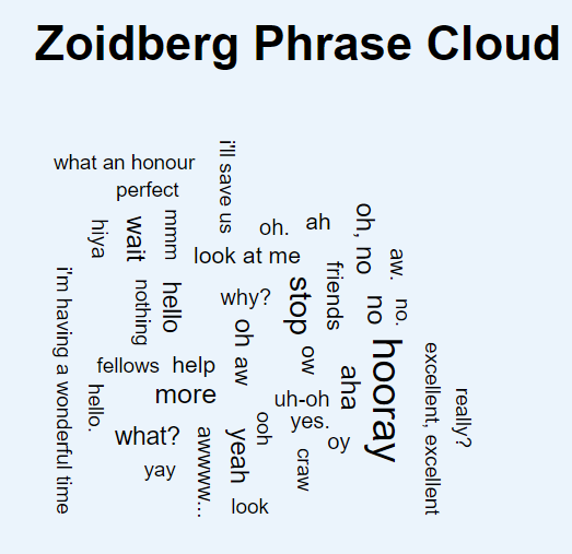
There is also a word cloud and phrase cloud that’s generated for the character, in this case Zoidberg. This includes the most commonly used words and phrases by that character in the show.
We used a common class for all our bar charts to reduce the complexity of our code base. The bars have also been fully styled with CSS.
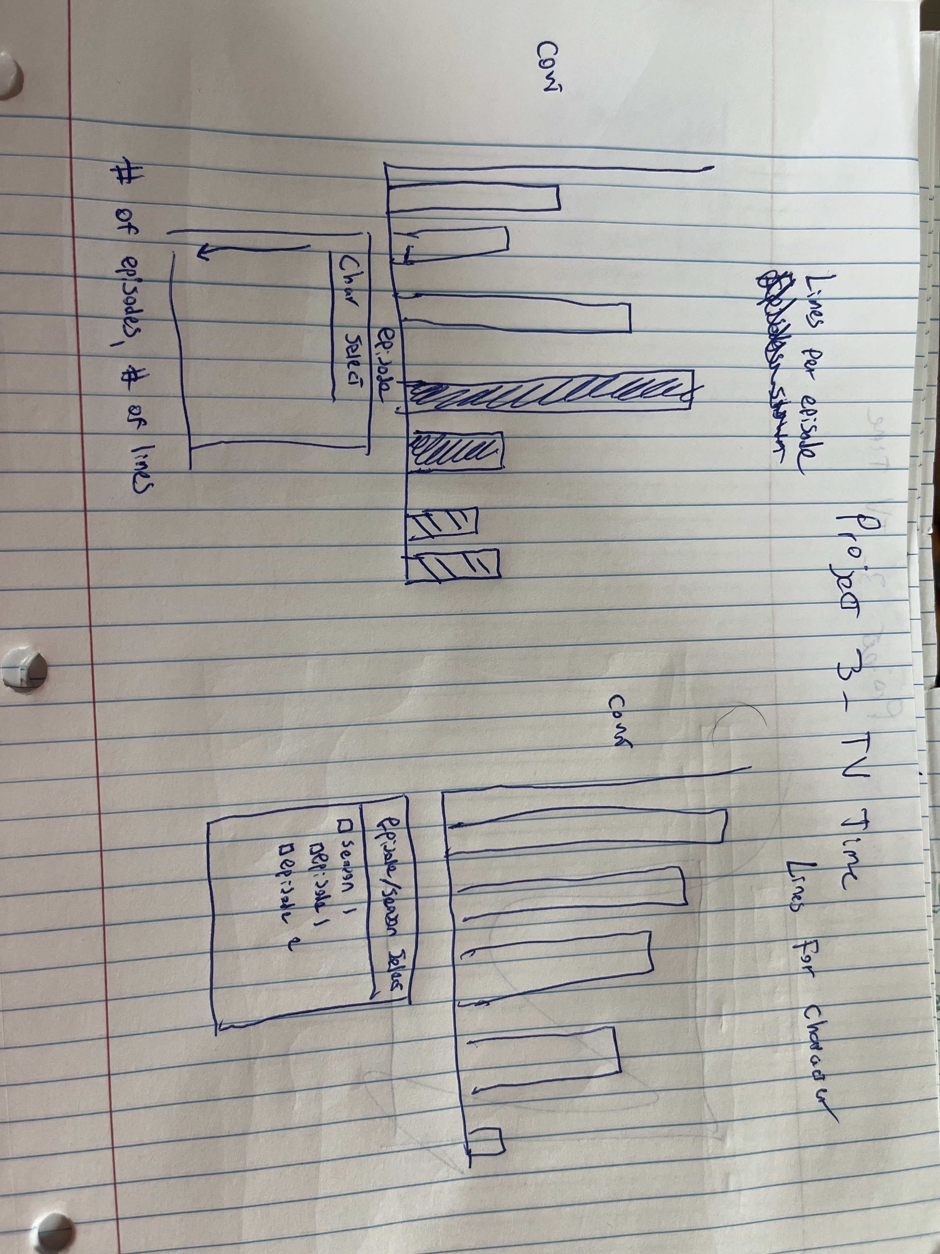
Our first sketch involved two bar graphs with tables for each – the bar graph on the right was for the lines per character, while the bar graph on the left was the lines per episode.
With this application, we discovered the following:
Fry has the most lines in the show.
Season 2 had the most number of lines for each character that was active in the show at the time. This is ironic considering Season 2 had 19 episodes while Season 3 had 22 episodes.
Some episodes feature particular side characters prominently. For example, Amy seems to be featured in s02e09, s04e01, s07e03, and s07e07
Zoidberg likes to say his own name a lot as present in his word cloud.
The application was written in JavaScript with its D3 library – each type of visualization had its own class (Barchart, Stacked Bar Chart, Word and Phrase Clouds) and was created in a main.js file. The code for the project can be found on GitHub and run using Python’s SimpleHTTPServer.
Kunal Kewalramani
Webpage Layout and Design
Character Details and Developing Corresponding Visualizations
Documentation
Demo
Nicholas Bowling
Sidath Marapane
Data processing
Word clouds
Character lines per episode Chart
William Leithauser
Lines per Season (for character) stacked bar chart
Character selector for the other stacked bar chart